Storytelling sections
Akira includes five editorial sections built for brand storytelling rather than straight product display: Mood reel, The Edit, Immersion lookbook, Brand film, and Comparison arena. Each follows the standard color scheme and padding pattern, plus its own content blocks.
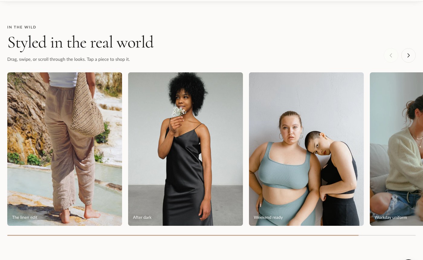
Mood reel
Mood reel is a draggable card gallery for lifestyle imagery. Visitors scroll or drag through a horizontal row of Moment blocks, and each moment can optionally tag a product so the imagery still drives sales.
| Setting | What it does |
|---|---|
| Kicker | Small label shown above the heading. |
| Heading | Main heading for the section. |
| Subheading | Supporting text under the heading. |
| Card width | Controls how wide each Moment card renders in the reel. |
| Color scheme | Sets the section's colors from your theme's color schemes. |
| Top padding / Bottom padding | Spacing above and below the section, in pixels. |
Add Moment blocks for each image in the reel. This section also supports an app block, so you can insert an app's content directly into the reel if needed.
The Edit
The Edit is a magazine-style feature layout designed for longer-form storytelling, such as a seasonal editorial or a founder's note. It combines Feature blocks with Pull quote blocks so you can break up copy the way a print magazine would.
| Setting | What it does |
|---|---|
| Kicker | Small label shown above the heading. |
| Heading | Main heading for the section. |
| Sub-line | A secondary line under the heading, useful for an "issue" or edition reference. |
| Color scheme | Sets the section's colors from your theme's color schemes. |
| Top padding / Bottom padding | Spacing above and below the section, in pixels. |
Build the layout from Feature and Pull quote blocks, mixed in whatever order suits the story. An app block is also available inside this section.
Immersion lookbook
Immersion lookbook is a full-bleed slideshow with hotspot-style slides, ideal for a lookbook where each slide can call out specific items in the frame.
| Setting | What it does |
|---|---|
| Slide height | Controls how tall each slide renders. |
| Autoplay | Automatically advances through slides. |
| Autoplay speed | How long each slide is shown before advancing. |
| Color scheme | Sets the section's colors from your theme's color schemes. |
| Top padding / Bottom padding | Spacing above and below the section, in pixels. |
Add one Slide block per image. An app block is available for adding app content alongside the slides.
Brand film
Brand film is a video hero with hotspots and a call to action, built for a cinematic brand or product film that also needs to convert.
| Setting | What it does |
|---|---|
| Background video (Shopify) | A video uploaded through Shopify's video picker. Takes priority over the external URL below. |
| Or external MP4 URL | A direct link to an .mp4 file, used only if no Shopify video is set. |
| Poster / fallback image | Shown before the video loads or if video can't play. |
| Stage height | Controls the height of the video area. |
| Overlay darkness | Darkens the video so text stays readable on top of it. |
| Kicker | Small label shown above the heading. |
| Heading | Main heading over the video. |
| Text | Supporting text under the heading. |
| CTA label / CTA link | Button text and destination. |
| Color scheme | Sets the section's colors from your theme's color schemes. |
| Top padding / Bottom padding | Spacing above and below the section, in pixels. |
Add Hotspot blocks to call out specific points on the video frame. An app block is available too.
Tip: If you don't have a Shopify-hosted video ready, use the external MP4 URL field so you can point Brand film at a video hosted elsewhere while you finish uploading the final file.
Comparison arena
Comparison arena lays out a feature comparison across columns, for example comparing your product tiers or comparing your product against a generic alternative.
| Setting | What it does |
|---|---|
| Kicker | Small label shown above the heading. |
| Heading | Main heading for the section. |
| Subheading | Supporting text under the heading. |
| Feature rows | One feature per line. Each Column block's own Features field should list a matching value per line: yes, no, or free text. |
| Color scheme | Sets the section's colors from your theme's color schemes. |
| Top padding / Bottom padding | Spacing above and below the section, in pixels. |
Add one Column block per option you're comparing. Keep the line order in each column's Features field identical to the order in Feature rows, or the rows won't line up. An app block is also available in this section.