Featured collection & product
Three sections built to surface products directly on a page: Featured collection for a grid or slider of products, Featured product for a single product spotlight, and Collection list for a grid of collection tiles.
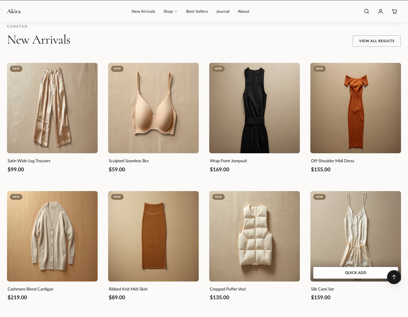
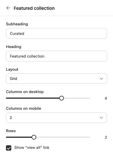
Featured collection
Displays products from a single collection, in either a grid or a slider layout.
| Setting | What it does |
|---|---|
| Subheading | Short text shown above the heading. |
| Heading | The section's main heading text. |
| Collection | The collection this section pulls products from. |
| Layout | Chooses between a grid or a slider display. |
| Columns on desktop | Sets how many product columns display on desktop. |
| Columns on mobile | Sets how many product columns display on mobile. |
| Rows | Grid layout only. Sets how many rows of products display. Ignored when Slider is selected. |
| Show "view all" link | Displays a link to the full collection page. |
| Color scheme | Sets the color scheme applied to the section. |
| Top padding | Space above the section. |
| Bottom padding | Space below the section. |
Supports app blocks in addition to the products pulled from the collection.
Featured product
A single product spotlight with a full add-to-cart form, useful for a hero product or a "shop the look" moment.
| Setting | What it does |
|---|---|
| Product | The product featured in this section. |
| Media position | Sets which side the product media appears on. |
| Show thumbnails | Displays clickable thumbnails for the product's additional media. |
| Show vendor | Displays the product's vendor name. |
| Show description | Displays the product's description text. |
| Show "view full details" link | Links through to the product's full page. |
| Color scheme | Sets the color scheme applied to the section. |
| Top padding | Space above the section. |
| Bottom padding | Space below the section. |
Blocks: Custom Liquid and app blocks, added alongside the product's add-to-cart form.
Collection list
A grid of collection tiles, useful for a homepage entry point into your main categories.
| Setting | What it does |
|---|---|
| Subheading | Short text shown above the heading. |
| Heading | The section's main heading text. |
| Show product count | Displays the number of products in each collection tile. |
| Columns on desktop | Sets how many collection tiles display per row on desktop. |
| Columns on mobile | Sets how many collection tiles display per row on mobile. |
| Color scheme | Sets the color scheme applied to the section. |
| Top padding | Space above the section. |
| Bottom padding | Space below the section. |
Blocks: Collection, added once per tile.
Tip: On Featured collection, the Rows setting only applies to the grid layout. If products aren't showing as expected, check whether Layout is set to Slider first, since Rows is ignored there.