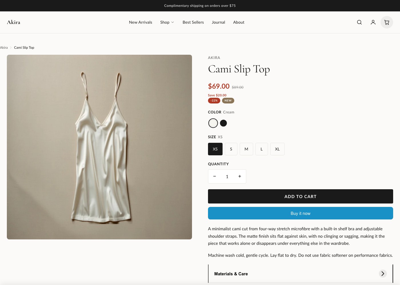
Product page
The product page is built from a single section, Product information, with a block-driven info column. You control what appears and in what order by adding, removing, and reordering blocks in the theme editor, rather than editing template code.
Section settings
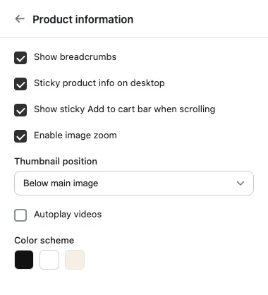
These settings on the Product information section control the gallery and overall page behavior, separate from the blocks in the info column.
| Setting | What it does |
|---|---|
| Show breadcrumbs | Displays the collection/product trail above the info column. |
| Sticky product info on desktop | Pins the info column in place while the customer scrolls through the media gallery. |
| Show sticky Add to cart bar when scrolling | Shows a persistent bar with price and buy button once the main buy buttons scroll out of view. |
| Enable image zoom | Lets customers zoom into gallery images on hover or tap. |
| Thumbnail position | Controls where gallery thumbnails sit relative to the main image. |
| Autoplay videos | Automatically plays video media in the gallery when it scrolls into view. |
| Color scheme | Sets the color scheme applied to this section, chosen from Theme Settings. |
| Top padding | Space above the section, in pixels. |
| Bottom padding | Space below the section, in pixels. |
Media gallery
The gallery supports standard images, video, and 3D models alongside each other, so you can mix product photography with a short video clip or an interactive model on the same product without any extra setup beyond uploading the media in Shopify admin. Thumbnail position and image zoom are both controlled from the section settings above. If autoplay is turned on, video media starts playing automatically as customers scroll to it, muted, and can still be opened and controlled manually.
Buy box blocks
Everything below the gallery, title, price, variant picker, buy buttons, description, and more, is a block. Blocks can be reordered freely in the theme editor, which means you can, for example, move the accordion above the buy buttons, or put SKU and inventory status right under the title. The full block list is below.
| Block | What it does |
|---|---|
| Title | Product title. |
| Price | Current price, including compare-at price when the product is on sale. |
| Rating | Star rating, pulled from your reviews app if one is connected. |
| Variant picker | Option selectors for size, color, and any other variant options. |
| Quantity selector | Stepper for choosing how many to add to cart. |
| Buy buttons | Add to cart and accelerated checkout buttons. |
| Description | The product description from Shopify admin. |
| SKU | Displays the variant SKU. |
| Inventory status | Shows stock level or availability messaging. |
| Share | Social share links for the product. |
| Accordion | Collapsible content blocks, useful for shipping info, sizing charts, or care instructions. |
| Custom Liquid | Drop in your own Liquid code or an app embed at any point in the info column. |
| Related products | A short list of related products. |
| Featured collection | Embeds a collection preview within the info column. |
| Recently viewed products | Shows products the customer has recently browsed. |
| Complementary products | Shopify's complementary product recommendations for this product. |
| Notify me form | Email capture form shown for out-of-stock products. |
| Countdown timer | A countdown, useful for limited-time offers. |
| Pre-order notice | A message for products available for pre-order. |
| Enquiry form | A contact form for customers to ask questions about the product. |
| Bundle contents | Lists the items included in a bundled product. |
| Selling plans | Subscription and purchase-option selector, see below. |
| Pickup availability | In-store stock lookup, see below. |
| Urgency indicators | Low-stock or high-demand messaging. |
| Upsell products | A small set of upsell products shown alongside the main product. |
| @app | Reserves a slot for any Shopify app block that adds itself to the product page. |
Selling plans and subscriptions
When a product has selling plans configured in Shopify admin, the Selling plans block lets customers choose between a one-time purchase and a subscription, with pricing for each option shown inline. Add the block wherever you want the purchase-option choice to sit relative to the variant picker and buy buttons. Products with Shop Pay Installments enabled show the installment breakdown near the price automatically, no extra block is required.
Pickup availability
The Pickup availability block shows real-time stock at your local pickup locations, using Shopify's local pickup feature. Customers can see which store has the item in stock without leaving the product page. This only appears for products and locations that have local pickup enabled in Shopify admin.
Accelerated checkout
The Buy buttons block includes accelerated checkout options such as Shop Pay, PayPal, and Apple Pay/Google Pay where available, shown beneath the standard Add to cart button. These are controlled by your payment provider settings in Shopify admin, not by theme settings.
Gift card products
When the product is set as a gift card in Shopify admin, the buy box automatically shows recipient form fields, name, email, and a personal message, so the gift card can be sent directly to the recipient at checkout.
Tip: Add the Accordion block once and use its own nested items for shipping, returns, and sizing content instead of adding three separate blocks. It keeps the info column shorter and easier to reorder later.