Hero & banners
Akira has three sections built for the top of a page: the Image banner for a single hero, the Slideshow for multiple rotating slides, and the Drop zone for countdown-driven product drops.
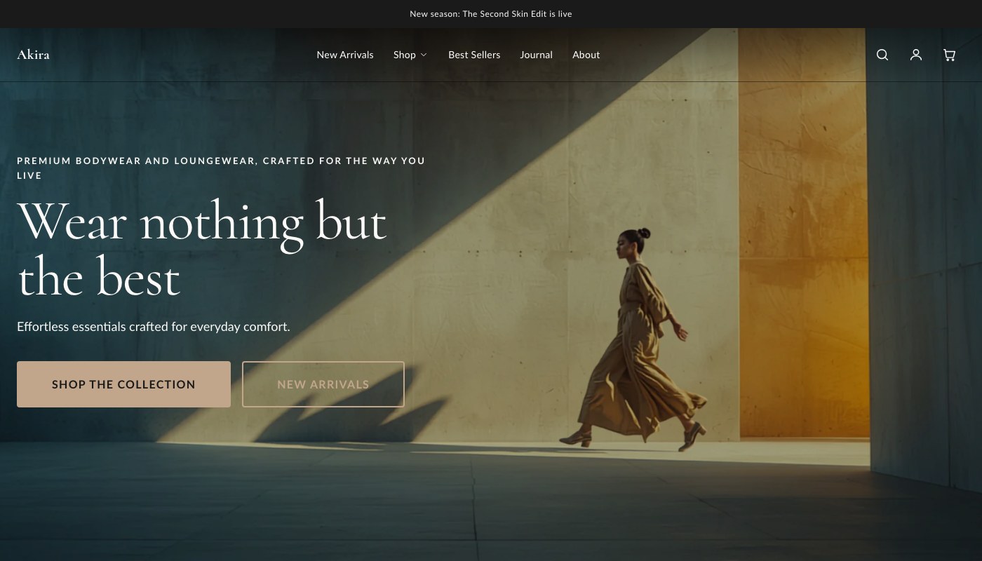
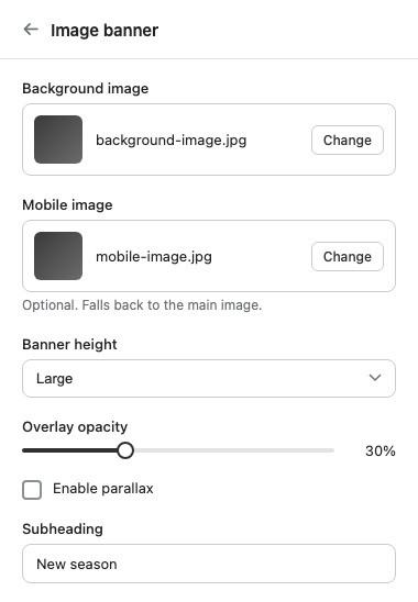
Image banner
A hero section with a background image or video, an overlay, and configurable content position. Good for a homepage hero or a strong opener on a landing page.
| Setting | What it does |
|---|---|
| Background image | Sets the main hero image. |
| Mobile image | Optional. Falls back to the main image if not set. |
| Background video | Optional. Plays muted and looping over the image. |
| Banner height | Controls the overall height of the banner. |
| Overlay opacity | Darkens the background image or video so text stays readable. |
| Enable parallax | Adds a parallax scroll effect to the background. |
| Subheading | Short text shown above the heading. |
| Heading | The banner's main heading text. |
| Heading HTML tag | Sets the heading's HTML tag. Use H1 when this banner is the main heading of the page, such as a homepage hero. |
| Text | Rich text shown below the heading. |
| Content position | Positions the content block within the banner. |
| Text alignment | Sets the alignment of the text within the content block. |
| Color scheme | Sets the color scheme applied to the banner. |
| Top padding | Space above the section. |
| Bottom padding | Space below the section. |
The Image banner uses one block type, Button, which you can add to give the hero a call-to-action.
Slideshow
Multiple rotating slides in one section, useful when you have more than one message or promotion to lead with.
| Setting | What it does |
|---|---|
| Accessibility label | Describes the slideshow for screen readers. |
| Slide height | Controls the overall height of the slideshow. |
| Auto-rotate slides | Automatically advances through slides instead of requiring manual navigation. |
| Change slides every | Controls how long each slide is shown before advancing. Only relevant when autoplay is on. |
| Top padding | Space above the section. |
| Bottom padding | Space below the section. |
The Slideshow uses one block type, Slide, which you add once per slide.
Drop zone
A countdown-driven section built for product drops. It shows a live countdown before the drop date, then switches to an ended state once the end date passes.
| Setting | What it does |
|---|---|
| Drop date/time | The date and time the countdown runs to. Format example: 2026-07-01 18:00 or 2026-07-01T18:00:00Z. |
| End date/time (optional) | When set, the drop shows as ended after this time. Before it, the live state shows a countdown to the end instead. |
| Kicker | Short label shown above the heading. |
| Heading | The section's main heading text. |
| Body | Rich text shown below the heading. |
| Image badge | Text badge overlaid on the image. |
| Featured product | The product this drop is built around. |
| Live CTA label | Button text shown while the drop is live. |
| Live CTA link (if no product) | Fallback link for the button when no product is selected. |
| Ended message | Text shown once the drop has ended. |
| Image (overrides product image) | Optional. Replaces the product's featured image in this section. |
| Color scheme | Sets the color scheme applied to the section. |
| Top padding | Space above the section. |
| Bottom padding | Space below the section. |
Tip: Set the Drop zone's end date whenever a drop is genuinely time-limited. Leaving it blank means the section stays in the live countdown state indefinitely, which is fine for an ongoing launch but misleading for a true limited drop.