Image & text layouts
This group covers six simpler sections used to mix images, copy, and small content grids throughout a page: Image with text, Collage, Multicolumn, Rich text, Logo list, and Scrolling text.
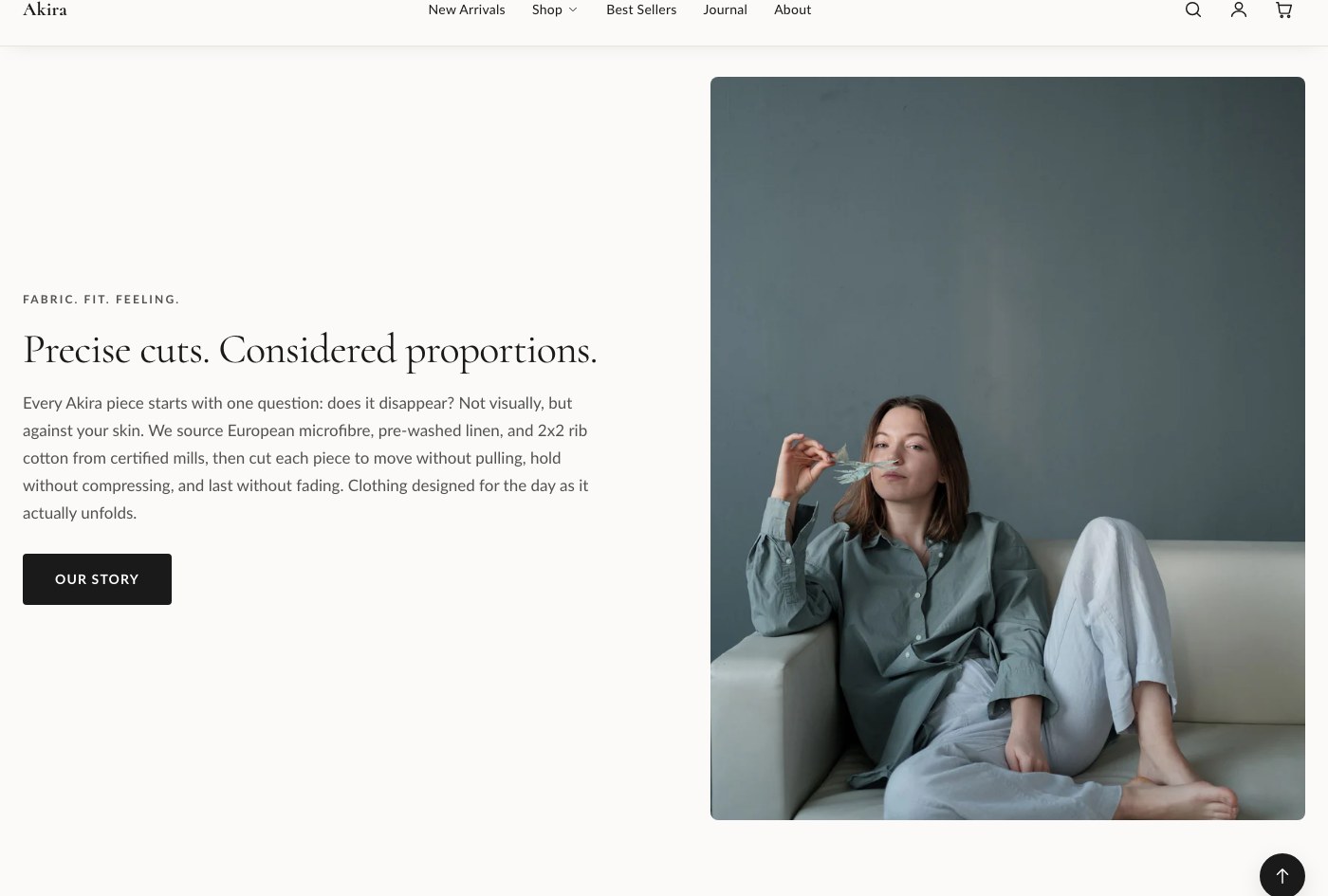
Image with text
Pairs an image (with an optional smaller overlapping second image) against a column of text blocks.
| Setting | What it does |
|---|---|
| Image | The main image. |
| Second image | Optional smaller overlapping image. |
| Image position | Sets which side the image appears on. |
| Vertical alignment | Aligns the content vertically against the image. |
| Color scheme | Sets the color scheme applied to the section. |
| Heading size | Sets the size of the heading block. |
| Spacing between blocks | Controls the gap between content blocks. |
| Top padding | Space above the section. |
| Bottom padding | Space below the section. |
Blocks: Subheading, Heading, Text, Button, and app blocks. Add and reorder these to build the content column.
Collage
A mixed grid that can combine products, collections, images, and video in one layout, with a heading above it.
Settings: Heading, Color scheme, Top padding, Bottom padding.
Blocks: Product, Collection, Image, Video.
Multicolumn
A flexible grid of columns, each filled with its own content, commonly used for feature call-outs.
| Setting | What it does |
|---|---|
| Subheading | Short text shown above the heading. |
| Heading | The section's main heading text. |
| Columns on desktop | Sets how many columns display on desktop. |
| Content alignment | Aligns the content within each column. |
| Color scheme | Sets the color scheme applied to the section. |
| Top padding | Space above the section. |
| Bottom padding | Space below the section. |
Blocks: Column, added once per column.
Rich text
A simple centered text block, good for a statement, mission line, or short callout.
Settings: Subheading, Heading, Text, Narrow width, Text alignment, Color scheme, Top padding, Bottom padding.
Blocks: Button.
Logo list
A row of logos, useful for "as seen in" or "trusted by" style rows.
Settings: Heading (short text shown above the logos, for example "As seen in" or "Trusted by"), Max columns (desktop), Color scheme, Top padding, Bottom padding.
Blocks: Logo, added once per logo.
Scrolling text
A continuously scrolling marquee of short text items.
Settings: Color scheme, Scroll speed (lower is faster), Text size, Top padding, Bottom padding.
Blocks: Text item, added once per phrase in the marquee.
Tip: These six sections all share the same padding and color scheme controls as the rest of Akira, so once you've set your usual top and bottom padding values on one, reuse the same numbers across the others for a consistent rhythm down the page.