Collection pages
Akira ships with three separate collection templates, grid, lookbook, and minimal, so you can pick the browsing experience that suits each collection. All three support faceted filtering and sorting, and a dedicated sale banner section is available to drop into any of them.
Choosing a layout
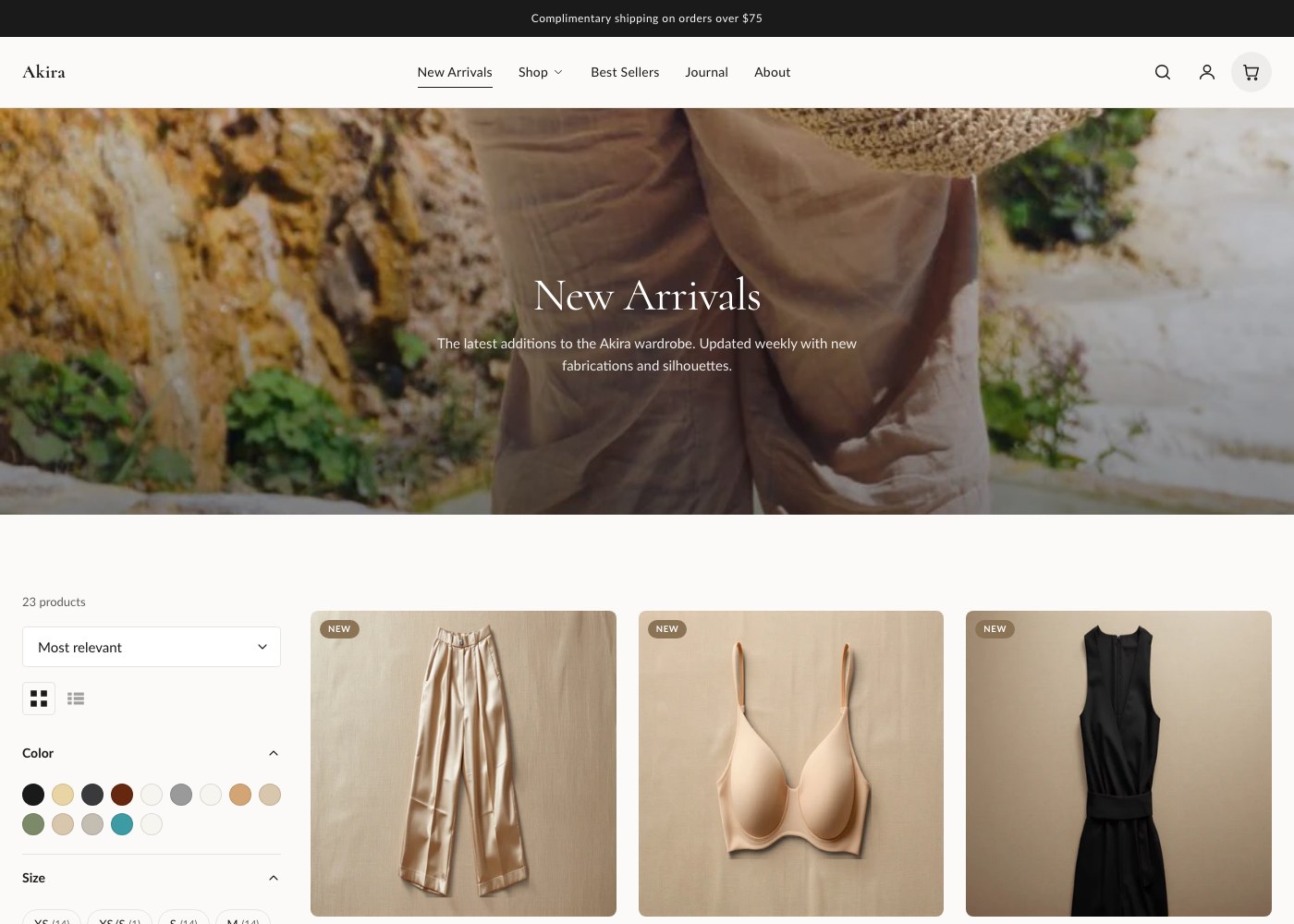
Grid (Collection grid) is the standard product grid with cards, quantity selectors, and quick view, and is the right default for most stores. Lookbook (Collection lookbook) is an editorial layout built for larger imagery and storytelling, better suited to a curated capsule or campaign collection. Minimal (Collection minimal) strips the layout down to image and price with tighter spacing, useful for dense catalogs. Assign a template to a collection from the Shopify admin collection editor, then customize it in the theme editor.
Collection grid settings
| Setting | What it does |
|---|---|
| Show collection header | Displays the collection title above the grid. |
| Show collection description | Displays the collection's description text. |
| Show collection image as banner | Uses the image set on the collection in Shopify admin as a banner. |
| Banner image override | Overrides the collection image with a custom banner for this page only. |
| Columns on desktop | Number of product columns on desktop screens. |
| Columns on mobile | Number of product columns on mobile screens. |
| Products per page | How many products load per page. |
| Enable infinite scroll | Loads more products automatically as the customer scrolls, instead of paginating. |
| Card style | The visual style used for product cards in the grid. |
| Button style | Controls how the Add to cart button appears on product cards. |
| Show quantity selector on card | Adds quantity +/- controls next to the button, for single-variant products only. |
| Color scheme | Sets the color scheme applied to this section. |
| Top / bottom padding | Space above and below the section, in pixels. |
Quick view settings
Quick view lets customers preview a product without leaving the collection grid. You control what appears inside it separately from the product page itself: show vendor, show description, show share buttons, and show buy now button.
Faceted filtering and sorting
Filtering and sorting are available on all three collection layouts. Customers can narrow results by availability, price, product type, vendor, and variant options, and sort the results independently. On Collection grid, you also choose the filter layout (for example, sidebar or horizontal bar) and whether filter groups start expanded or collapsed. Two settings let you upgrade specific filter options visually: list the option names that should render as color swatches, and separately the option names that should render as pill-style chips, both matched by name, case-insensitive.
Tip: If your color option is named "Colour" rather than "Color", make sure you type it exactly that way in the swatch option names field, since matching is case-insensitive but not spelling-tolerant.
Lookbook layout
Collection lookbook trades the uniform grid for an editorial layout with configurable grid pattern and image ratio, and gives you a choice of overlay style for how product info displays on each image (for example, always visible or revealed on hover). You can also show the vendor, swap in a second image on hover, and add hover CTA text with your own wording.
Minimal layout
Collection minimal focuses on density: a plain card style, adjustable image ratio, adjustable spacing between items, and an optional sale badge. It's a good fit for collections with a large number of similar products where browsing speed matters more than storytelling.
Sale banner section
The Sale banner section can be added to the top of any collection to promote a sitewide or collection-specific sale. It supports a heading, subheading, description, and optional coupon code, a background image for hero and split styles, a countdown to a sale end date, and an optional urgency bar showing a claimed-percentage message.
Collections list
The Collections list section, used on the all-collections page, lets you set a heading, choose how collections are sorted, show a product count per collection, and control desktop and mobile column counts.