Kodiak Leather
- Location
- United States
- Industry
- Leather goods
- Platform
- Shopify Plus
- Scope
- Mobile checkout rebuild, product page redesign
A rugged, handcrafted leather goods brand. We rebuilt the two places a considered purchase is won or lost: the product page and the mobile checkout.
Visit the store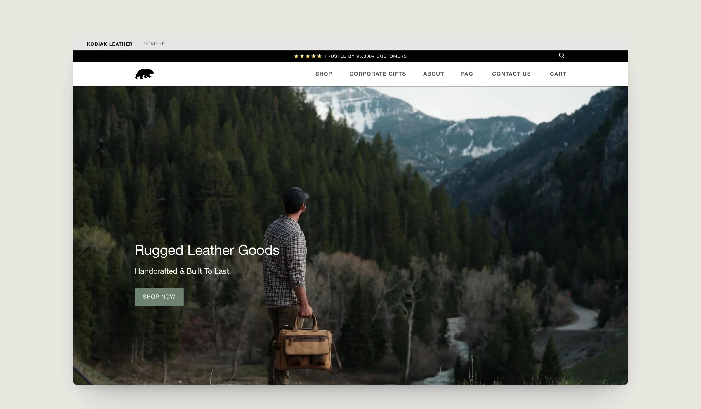
Capabilities proven here
Services behind this work Shopify Plus development/Shopify theme development
The brief
Kodiak makes full-grain leather bags and accessories that are built to last, and priced like it. A buyer spending that kind of money wants to see the leather, the colour and the build before they commit.
The brief was simple to state and hard to do well: make the path from product to paid order shorter and more convincing, without losing the outdoors character the brand is known for.
On a phone that problem is sharper. A leather bag is a purchase people research, so the mobile page has to show the leather properly, keep the colour choice obvious and get out of the way at checkout, all on a small screen.
Services & technology
- Product page redesign
- Mobile checkout journey
- Collection merchandising
- Conversion optimisation
01Homepage
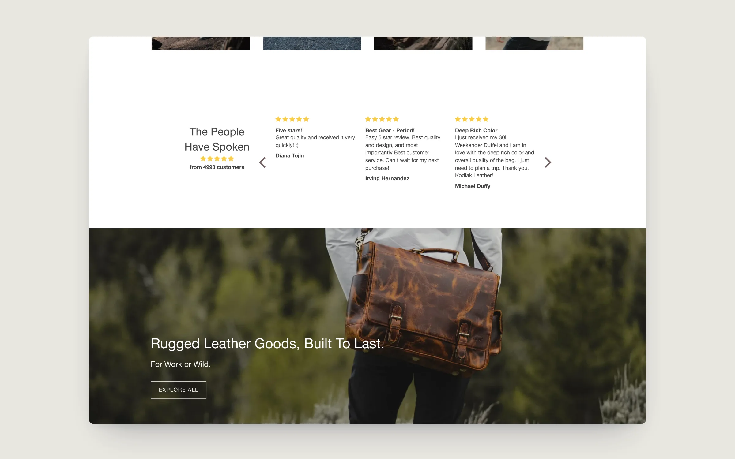
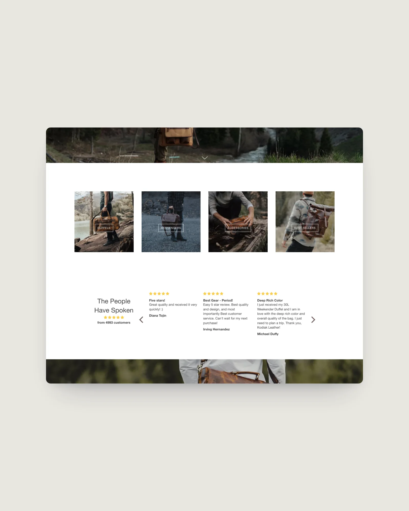
The brand story first, then straight into the range.
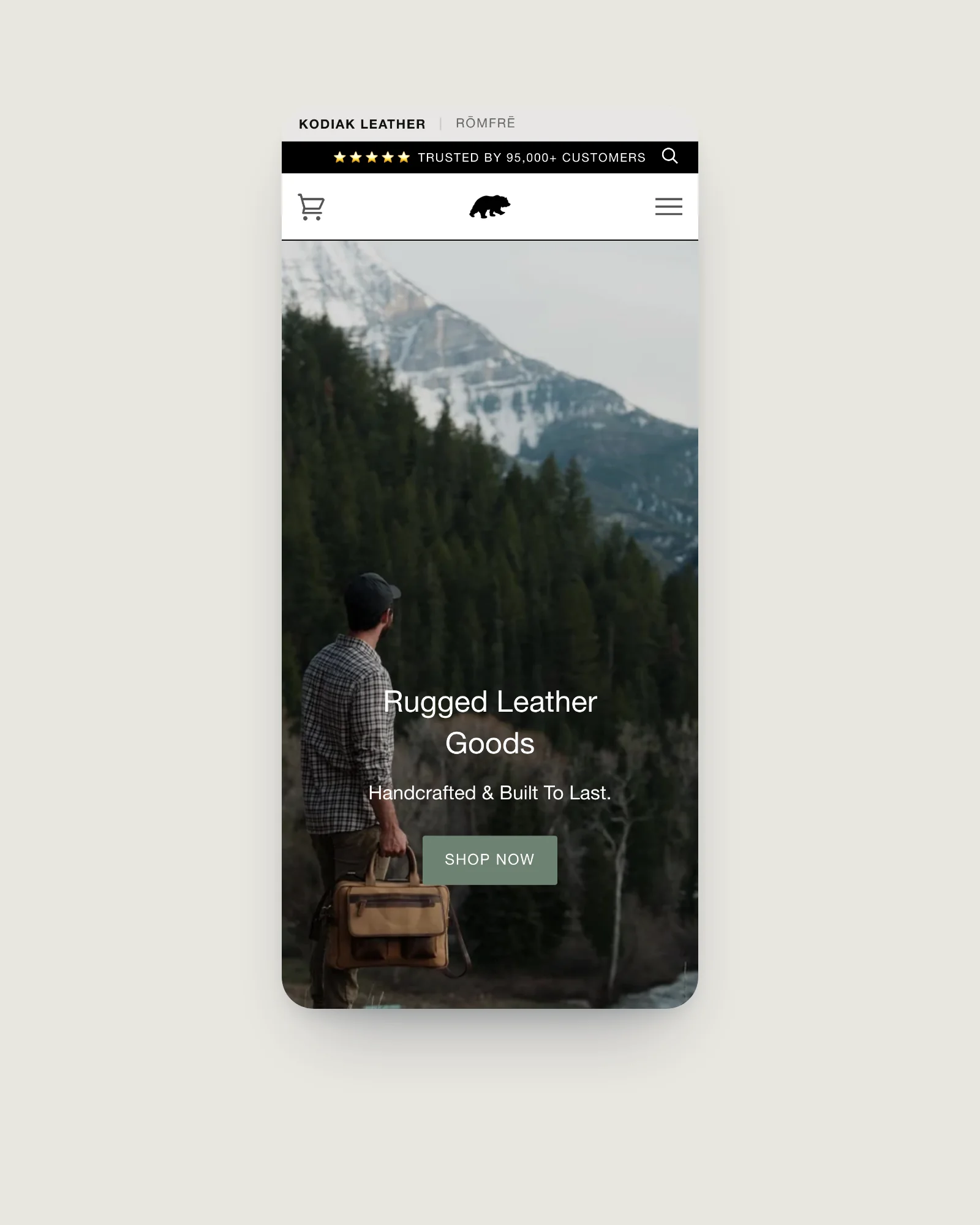
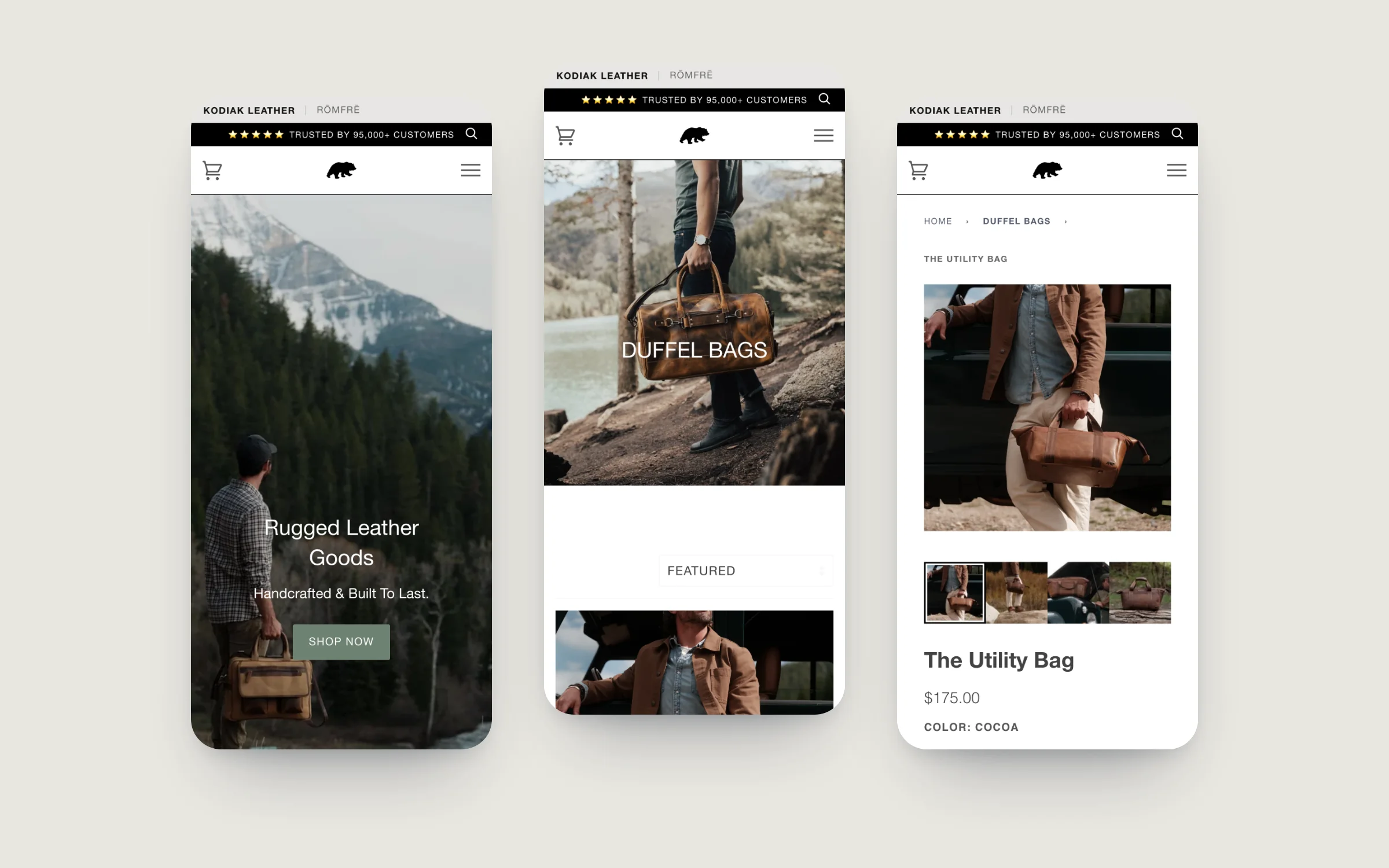
The homepage opens on the landscape the bags are made for, with one clear call to shop. Below it, customer reviews under "The People Have Spoken" do the persuading, and feature blocks like the Ultimate Weekender take a buyer straight to the hero products.
02Collections & filtering
Collections that let the leather sell itself.
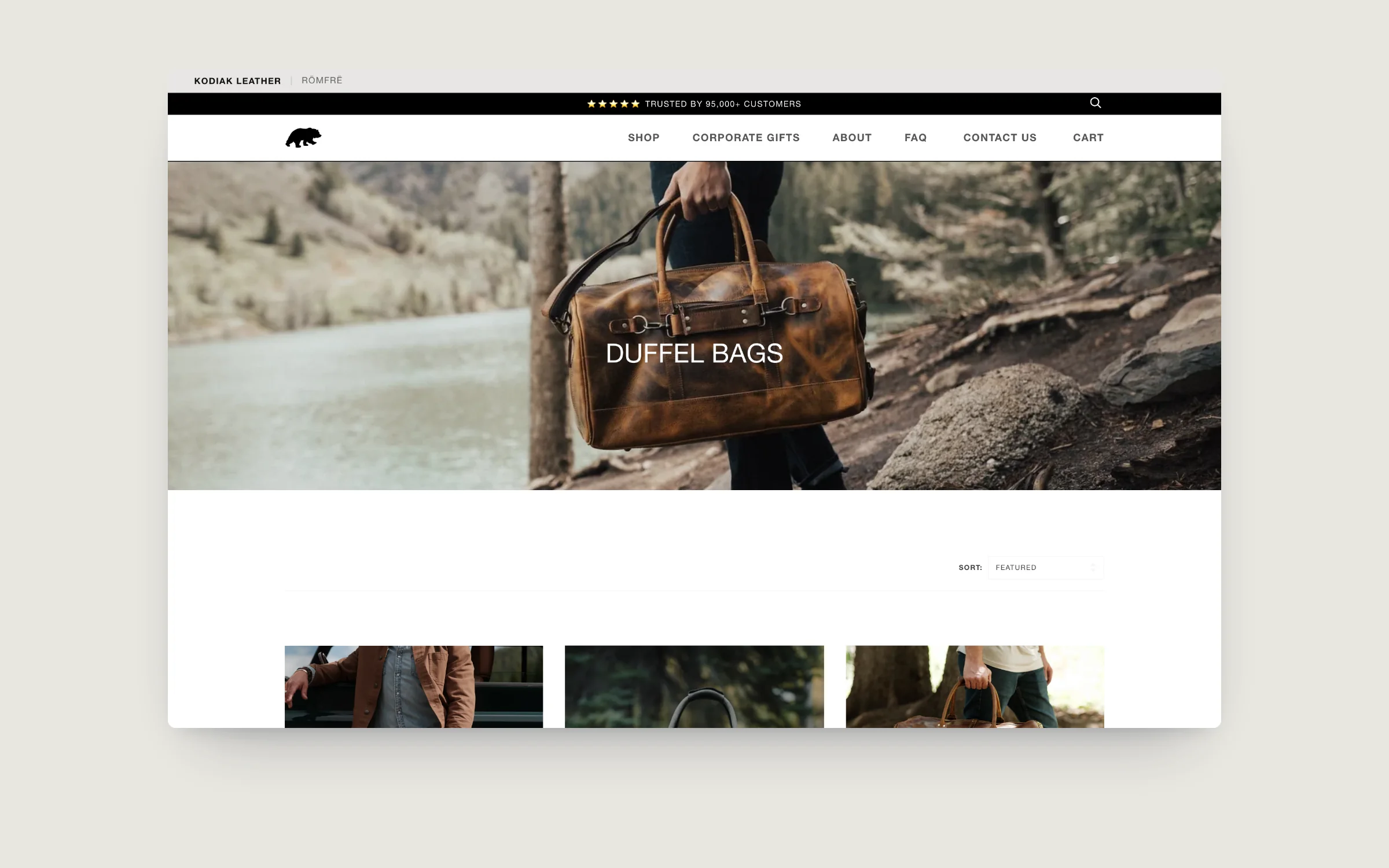
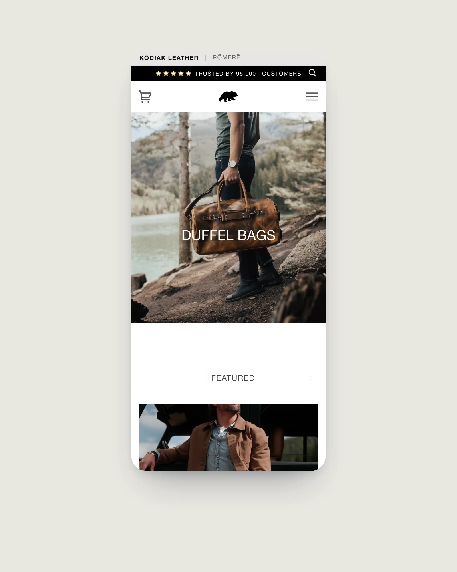
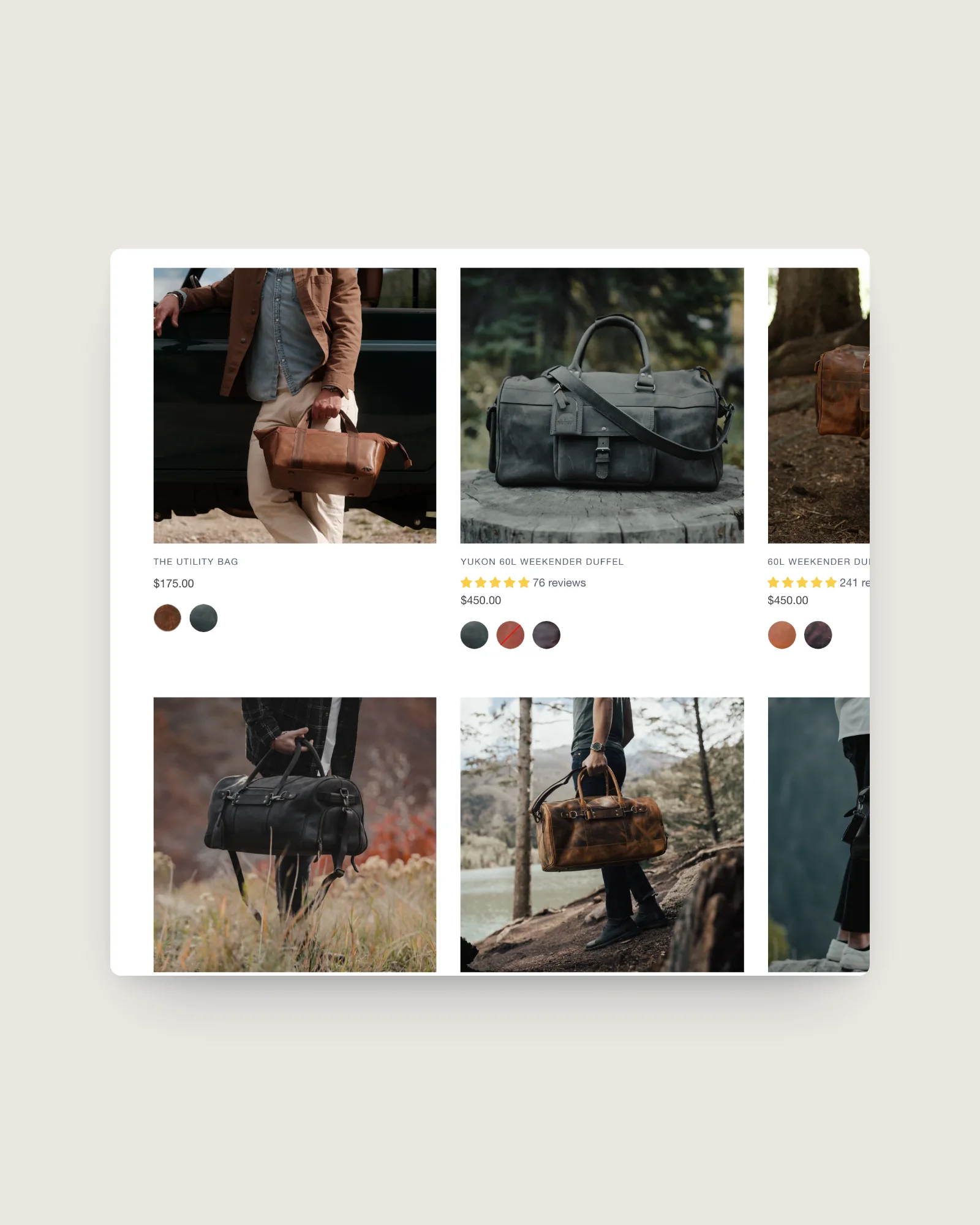
Collections open with a full-width lifestyle banner, then a clean product grid with sorting, so the photography carries the decision and the grid gets out of the way.
03Product page
Product page redesignShopify theme development
Everything a considered purchase needs, above the fold.
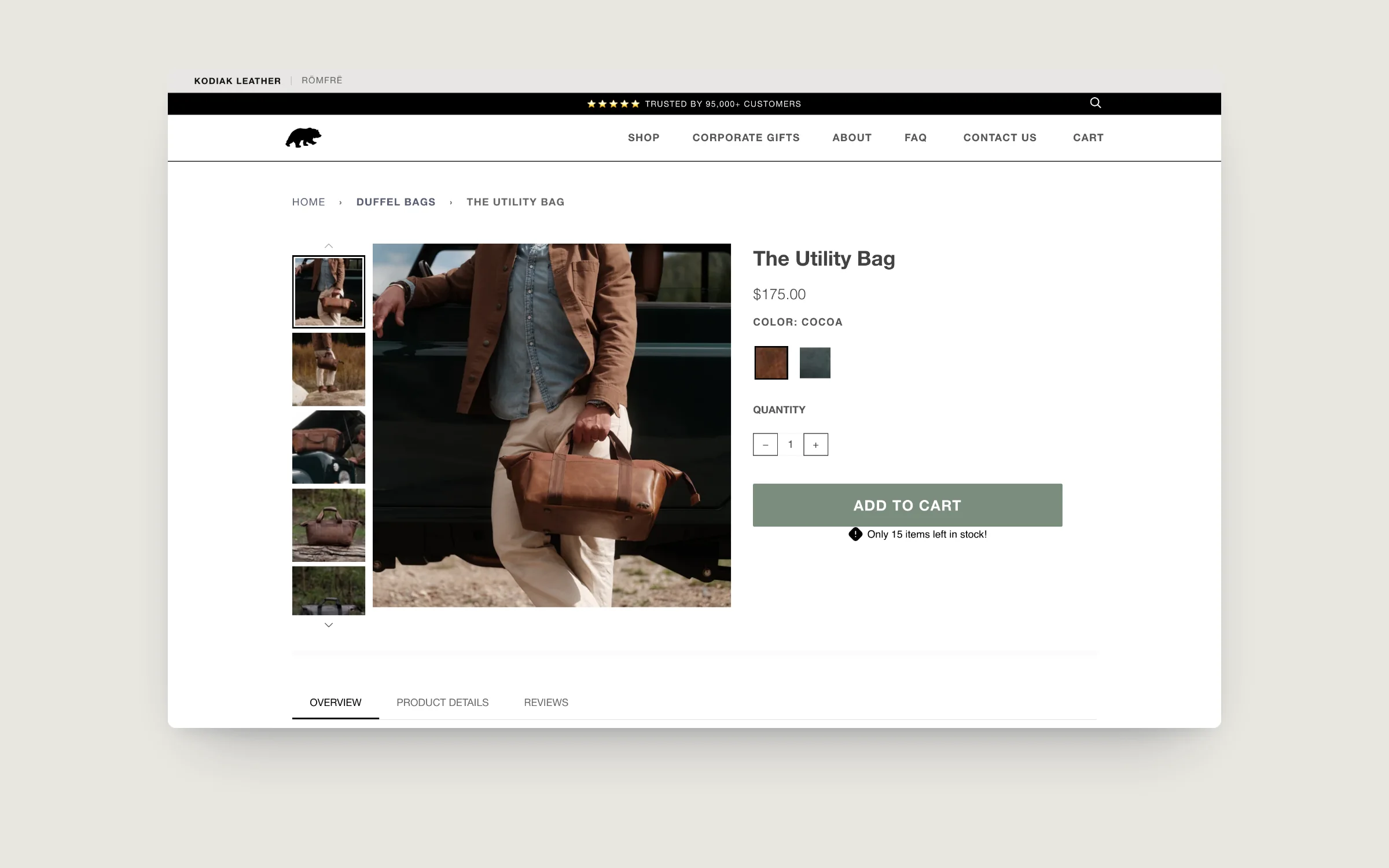
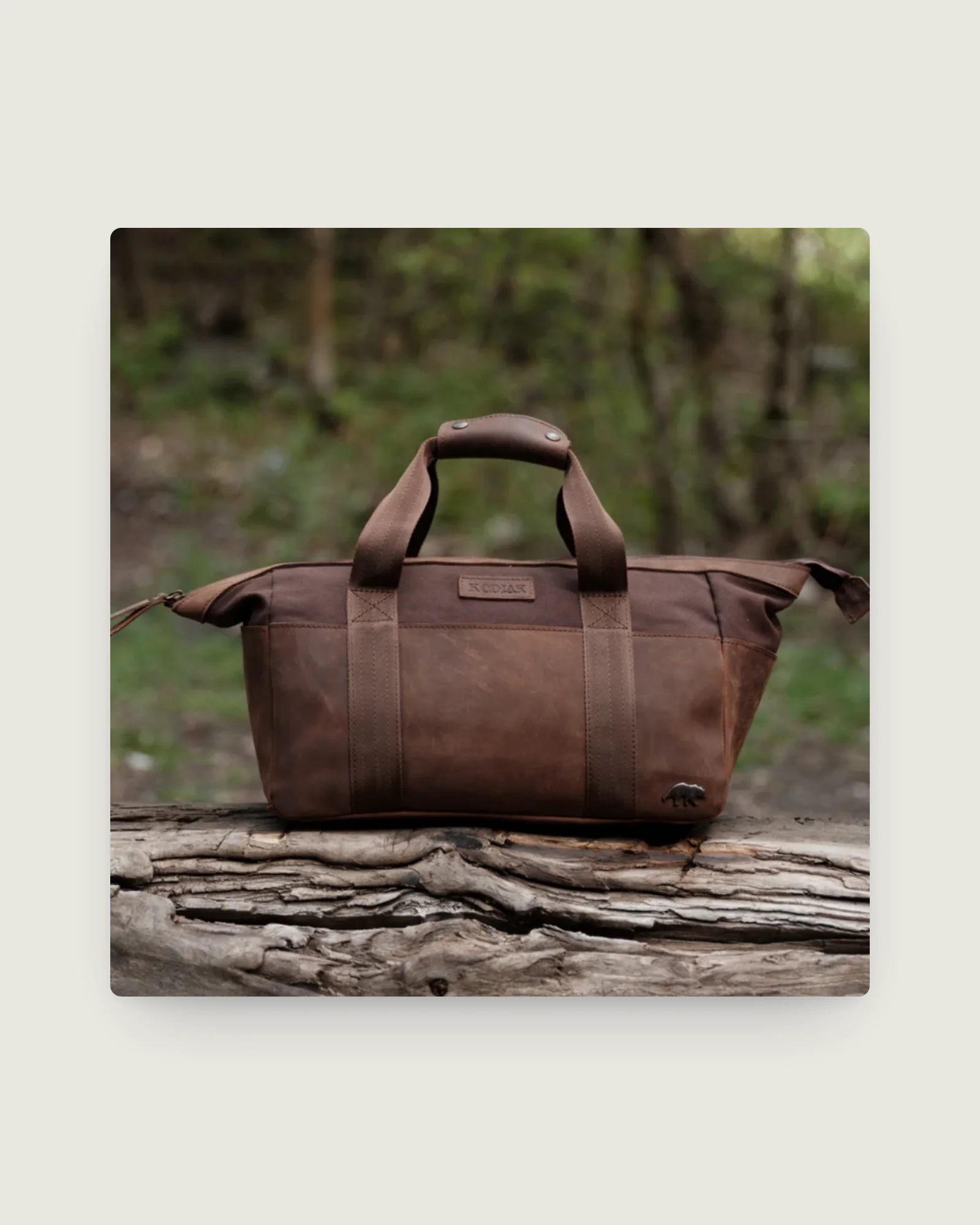
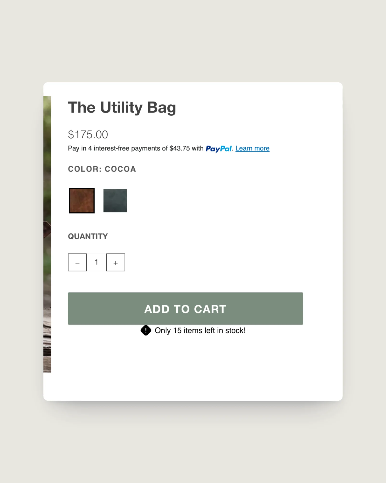
The product page leads with a large gallery and a colour choice shown as real leather swatches, not just names. Price, quantity and a single add to cart sit beside it, with a live low-stock note where it applies.
Overview, product details and reviews sit in tabs underneath, so the page stays calm for someone ready to buy and thorough for someone still deciding.
Real swatches, and a cart that slides in
Colour is chosen from leather swatches, and adding a bag opens a slide-out cart instead of a separate cart page, so a phone buyer stays on the product and moves straight to checkout.
Example leather duffel
$200.00
Colour: TanDark brownCharcoal
Your cart (0)
Example leather duffel
TanDark brownCharcoal
Example products and prices for illustration only. Not Kodiak Leather’s data.
04Mobile
Mobile checkout journeyShopify Plus development
A checkout journey rebuilt for the phone.
The mobile journey was rebuilt end to end, from gallery to colour choice to checkout, so a customer can buy a bag in a few taps without pinching, zooming or hunting for the button.
Results
Conversion optimisationShopify Plus development
The rebuilt product pages and mobile checkout lifted Kodiak's conversion rate by 85%.
- 85%
- Lift in conversion rate
Figure supplied by Kodiak Leather.
Under the hood
Cart drawerShopify theme development
The stack behind the product page and checkout.
Kodiak runs on Shopify Plus with the Pipeline theme, version 2.4, read from the live page source. These are the pieces a shopper touches on the way from product to paid order today:
- Colour as real leather swatches. Colour options render as swatch images on product pages and collection cards, so a buyer compares the actual hides rather than colour names.
- Reviews in the product page tabs. Judge.me reviews sit in the tabbed area under the buy box, alongside Overview and Product Details.
- A cart drawer instead of a cart page. Adding a bag opens a slide-out cart, so a mobile buyer stays on the product and moves straight to checkout.
- Product protection and messaging. The page source loads Extend product protection, Klaviyo for email and an SMS marketing tool, plus PayPal alongside Shopify Checkout.
- US and Canada. The homepage declares English and English-Canada versions in its hreflang tags, so Canadian shoppers get their own version of the store.
Product structured data on Kodiak is written as schema.org microdata in the theme markup (Product, Offer and Organization) rather than as a JSON-LD block.
Measured today
Checked on 3 October 2026.
We re-read the live store and Google’s real-visitor data on 3 October 2026. These figures describe the store as it runs today, including any apps and campaigns added since our work.
- Real visitors (Google Chrome UX Report, whole store, phones, 75th percentile, 28 days to 3 Oct 2026): Largest Contentful Paint 2.0 s, Interaction to Next Paint 120 ms, Cumulative Layout Shift 0.00. All three Core Web Vitals are inside Google’s “good” thresholds for real mobile visitors.
For similar merchants
What a premium brand can take from this.
When a product costs real money, the work that pays is rarely on the homepage. It is on the product page and in the mobile path to checkout: a gallery that shows the material, options that look like the thing you get, reviews close to the buy button and a cart that does not throw the buyer off the page.
The 85% figure above comes from Kodiak’s own data. What we can measure independently is how the store performs for real visitors now, and on that the mobile experience holds up.
If your conversion rate on mobile trails desktop by a wide margin, start where Kodiak did: watch a real customer try to buy on a phone, then fix every point where they pinch, zoom or hunt for the button.
Questions
What usually lifts conversion rate on a premium Shopify store?
The product page and the mobile path to checkout. Large photography that shows the material, options shown as real swatches, reviews near the buy button and a short, thumb-friendly route to checkout do more for a considered purchase than homepage changes.
Does Kodiak's 85% conversion lift come from Tripster's own data?
No. The 85% figure was supplied by Kodiak Leather. The performance figures in the Measured today section are our own, taken from the live store and Google's Chrome UX Report on 3 October 2026.
Is a cart drawer better than a cart page on mobile?
Often, for single-item purchases. A slide-out cart keeps the shopper on the product and puts checkout one tap away. It is worth testing against your own data, because stores where customers build large baskets can still prefer a full cart page.
Related case studies
All work Leather bagsRömfre A mobile-first store with quick add from the collection grid and local pickup shown on the product page.
 Fine jewelryFerkos Fine Jewelry Eight years together, from a Basic plan to Shopify Plus and from $10k to $1.5M in order volume.
 Beef & lamb boxesBurgess Peaks The whole store built end to end, connected to Facebook and Instagram, with homepage image memory cut from 75.7 MB to 8 MB.